Set Revamp- The Sting, Shaw's Betting Parlour
- siennamason5
- Apr 12, 2024
- 7 min read
Updated: May 23, 2024
Project 3
Date: 5 Feb- 8 Mar
Brief- Technically draw up and re-imagine one of 5 film sets as a film for a completely different genre.
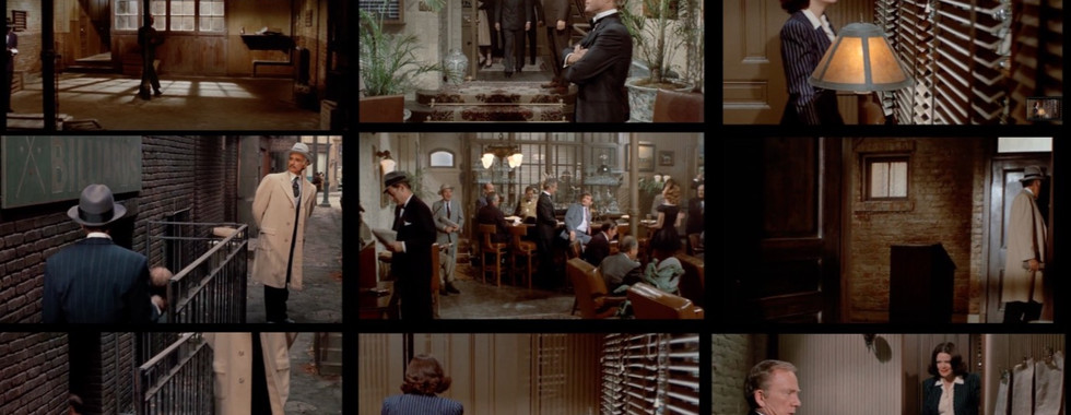
My chosen film - Shaw’s Betting Parlour, The Sting (George Roy Hill, 1973)
Reimagined it as a crime/horror film, with the set being a serial killers basement 'Danny's Basement'
My Initial Research

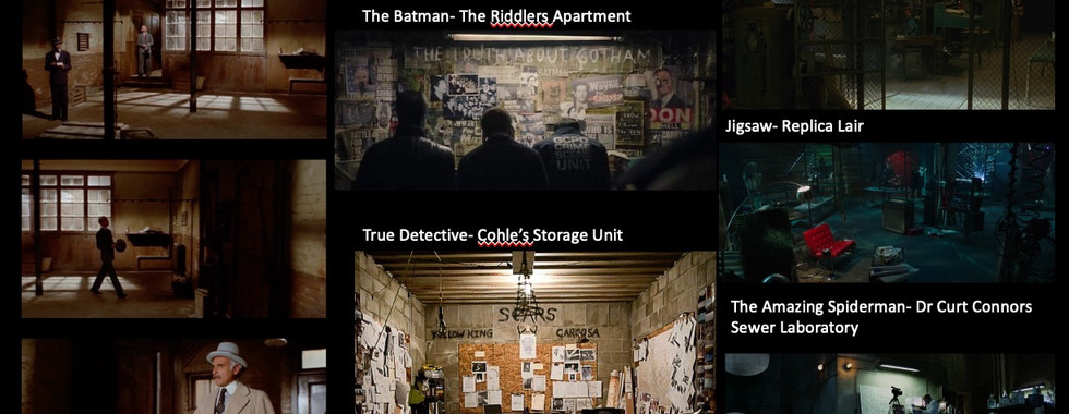


Beginning this project I was immediately drawn to the sting as it reminded me of crime/horror film sets I'd seen before, specifically the serial killer's 'The Ridler' apartment in The Batman (2022). While researching this set in particular I discovered the apartment is used to communicate the character's personality, which inspired me to use this project as an opportunity to look into character design, psychology and set dressing to create a design which represents my character. As someone already interested in criminal behaviour and psychology, I was excited to learn more about it and also learn how I can apply this interest in my designs.

Character Design
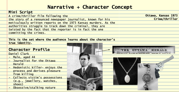
As I wanted my set to represent a character I decided to create a character profile. I found this beneficial as I could refer back to it while designing the set, and it made the story much more cohesive and logical.
The Technical Drawing Stage


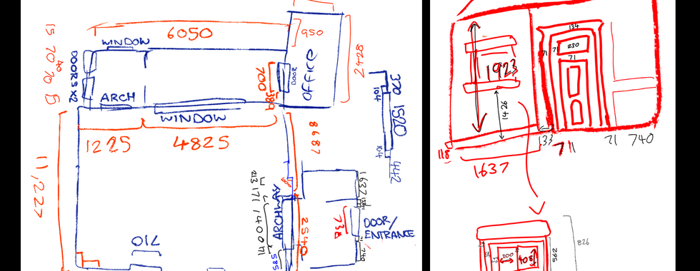
When starting the technical drawing, I initially found it difficult to visualise how the set looks like from the scenes shown in the film. to tackle this, I found roughly sketching out the floor plan first to be really helpful. It helped me understand the logic of the set and understand it better when watching the show.
To gain measurements I mainly used the heights of actors, but at times when I could not do this I looked into average door heights and widths, and also average brick heights. Measuring a set using images isn't something I have done before, so it was rewarding learning Photoshop tools to do this and it was rewarding seeing this turn into a successful technical drawing and model. Due to this, in the future, I want to bear in mind that I can use standard heights of doors, bricks and people to help me with measurements.
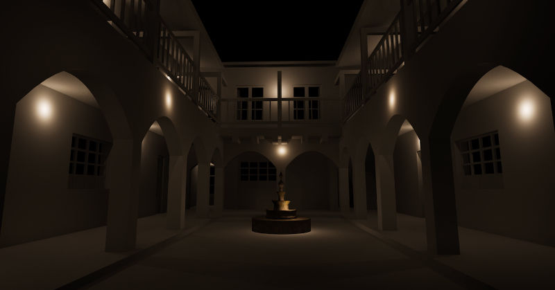
Rendering on Twinmotion
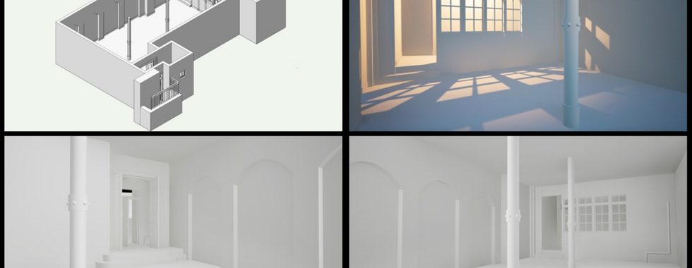


After having a lecture on Twin Motion, I decided to experiment with rendering. This is a skill I've always been interested in learning but haven't tried yet. The process was surprisingly simple and I got used to using the tools quickly which helped my confidence with my 3d model. I found experimenting with lighting settings and colours to be really rewarding, which encouraged me to develop this and create a fully rendered model for creating my visuals later on.
The Technical drawing

Changes made from the original set:
- turned the first office into a corridor leading up to the 2nd office
+ edited dimensions of the 2nd office to be the size of a small dark room (1450x2438)
Reflection:
At first, my isometric view was too large and I couldn't fit in other details, however, I learnt I could make the isometric view smaller and this saved space
It was initially hard to figure out which sections and elevations I needed to show, but I learnt to show those that were needed and important for the construction crew
I learnt I need to change walls from being filled black to being hatched
I learnt the extrude along path tool to make pipes which I can see being extremely helpful with things like pillars in the future
I found the door details tedious but I'm glad added them and I now feel more confident with details like this.
Visuals
Developed Research

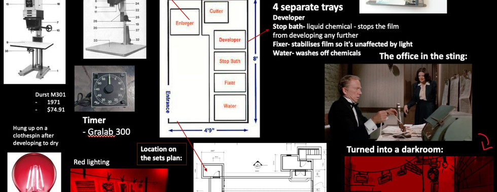
One idea for my visuals was to show the character's dark room, however, I was worried for time and thought designing just the main space would give more room for creative freedom and time to add details. I instead just kept the research page on dark rooms, with a small sketch to communicate how that room would look.
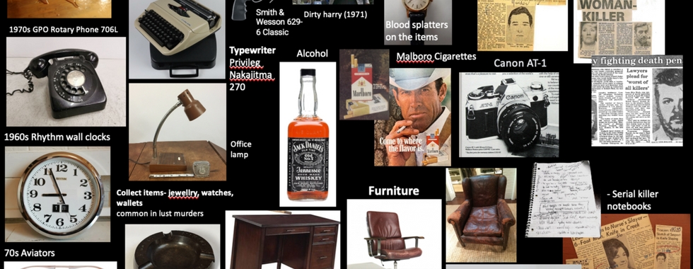
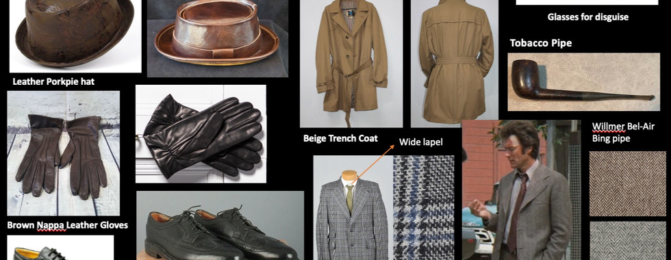
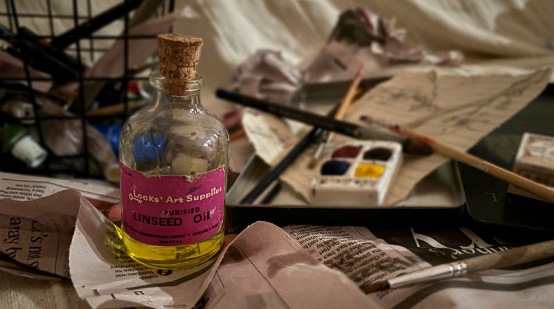
For researching props and costumes, I looked at prop houses, auctions, second-hand shops and advertisements to find period-accurate references from America in 1973. This helped develop my research skills especially when it comes to period accuracy, and also gave me helpful mood boards to refer back to when creating my visuals.
Thumbnails
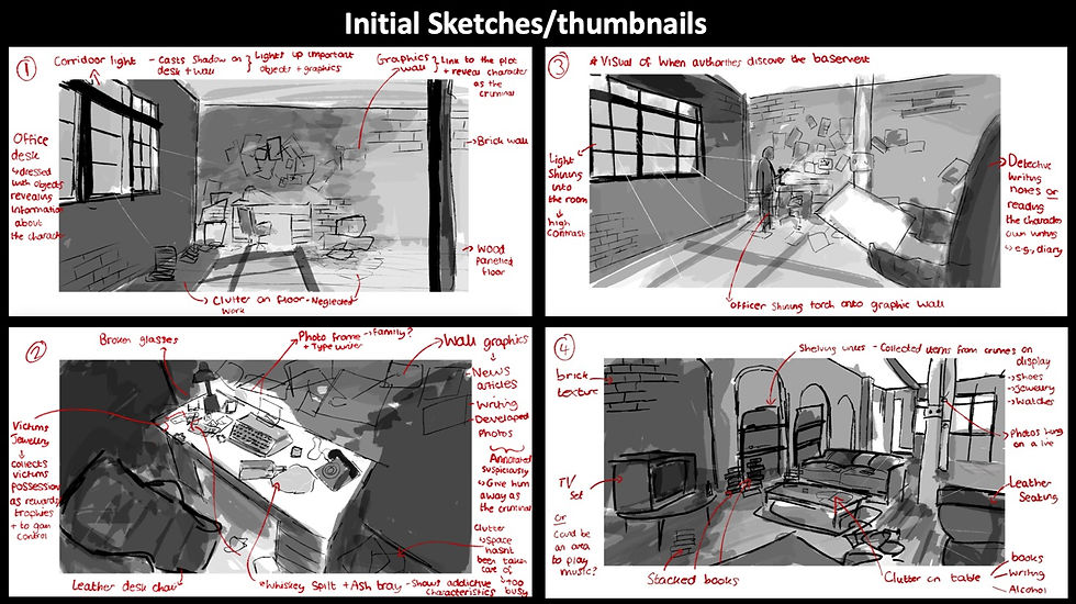
This is a method I found to be helpful in the Quickfire skills project and so I decided to do the same thing for this project to plan my visuals. The process made me think about lighting, proportions, how much space I had and needed to dress, etc, and like the mood boards, became a helpful reference. Since creating thumbnails I've seen my skills improve with my visuals and I've recieved more positive feedback for them, so it's a technique I'm going to continue using.
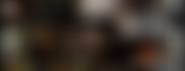
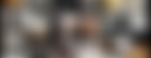
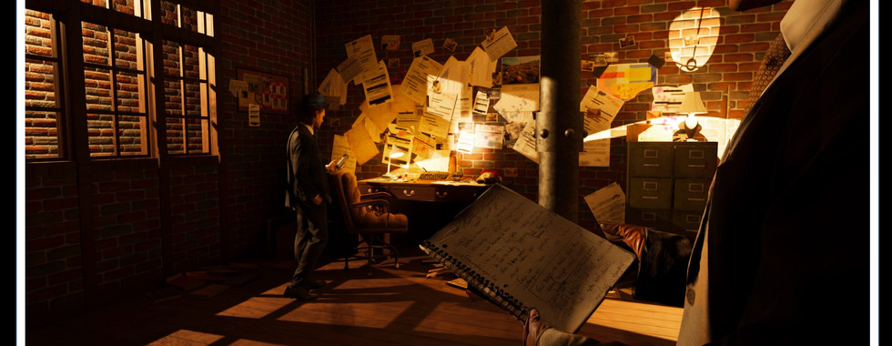
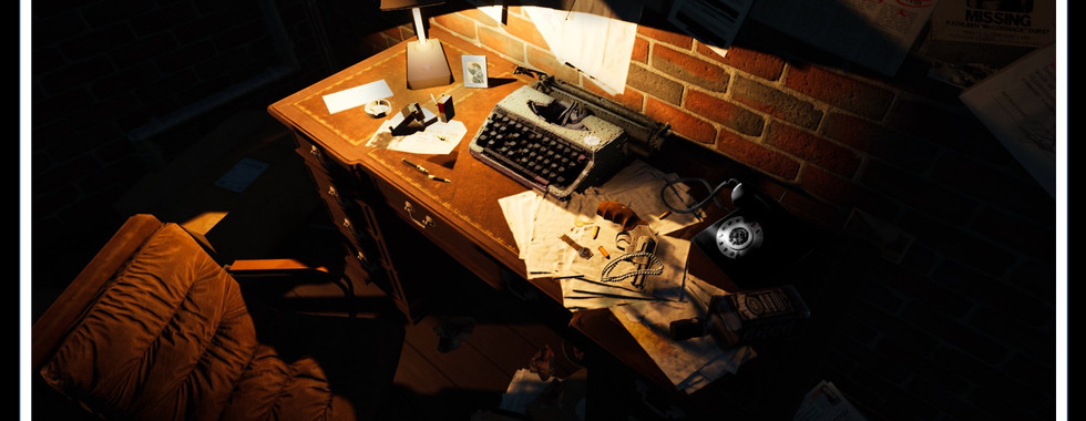
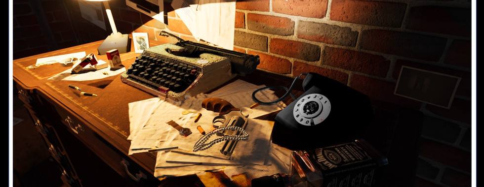
The Final Visuals


My reflection:
Overall, I am extremely pleased with my visuals. I think I took on board feedback well during tutorials which improved my final visuals and taught me a lot about how to problem-solve. For instance, my visuals were way too dark at first which I learnt is a problem for the DOP and I needed to add more lighting. I took inspiration from the green lamps in Se7en (Fincher, 1995) and added lots of table lamps to light the set while still having a low-lit, ominous atmosphere.

As I created these visuals on Twinmotion, I also had trouble with input delay with the software being so large on my computer- but I combated this by changing the quality to low while editing and putting it back up to high when testing lighting and shadows and when taking photos of my design. I also decided to photoshop some details after, editing areas that aren't accurate on twin motion- for example, I changed the colour of the typewriter, phone and desk lamp to make them more period accurate; and I photoshopped real articles which suit my character's crimes, added writing to the notebook, and added shadows and dirt to give more texture.
I am also glad I decided to try something new and experiment with twin motion. It has taught me a lot about how lighting and shadows work and I really enjoyed the user interface and the features the software has- 3d rendering is now definitely something I want to improve and use again.
Feedback from the presentation for my portfolio:
The rotary phone is broken- so I'll add the missing part on Photoshop
Use 8-ish different style torso mannequins, hand mannequins, and watch holders to add more drama. One that's broken, from a shop, from a dumpster for example.
Complimented for the contrast of mess and order which I was pleased to hear
Experiment with plastic greenery covered in dust- reflect the opposite of the warm colour palette
Potentially change the brickwork in the corridor as it's so close- change to a different texture like damp plaster
Edit the brickwork to add more textures- makes
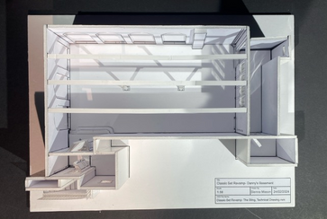
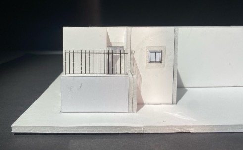
White Card Model
Made by printing out my plans and elevations
Pillars are 3D printed
Model Video link:https://youtu.be/vJvPry3qcqg


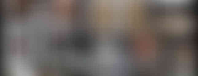
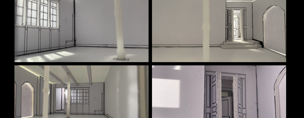
Interior Images


Like my model in the Quickfire skills project, rather than laser cutting i decided to print off each section on my vectorworks model and cut them out on foam board. I wanted to think about wall thickness in this model and foam board allowed me to do this. Due to there being a large amount pieces to put together after cutting out each wall, I numbered each side like a puzzle and linked them to numbers on my floor plan. This was tremendously helpful and made the construction process quicker and more successful, so it is a technique I will bear in mind for future models.
I did however find myself having to go back and print more sections from my vectorworks model. I believe this is from not properly planning how many walls I needed to print- and so in the future, I'll be more thorough with planning my model,
Some extra details this model taught me was how I can use the photography studio to create coloured lighting and to position lighting by the model window to show shadows created by 'natural lighting'. I also decided to 3D print and print on acetate for the first time, both were far easier than I expected and saved me a lot of time while still giving an effective look for the pillars and windows in my model.
One thing I will do differently in the future is think about interior walls- they should be made with a thinner material than exterior walls and this would've made it slightly easier to cut out the interior windows and doors.
Overall Reflection
Reflecting on this project as a whole, I thoroughly enjoyed it. I found it intimidating as a lot of the skills I was using were new and I wasn't confident in them- like 3d printing, 3d rendering, and drawing up plans and elevations from just photos.
However, I'm glad I trusted the process, used Twinmotion and committed to 3d printing- they're 2 major new skills I've learnt and I think they helped my work improve massively.
I did have plans to create graphics for the main collaged wall, but with the time budget, I had to compromise and look at real articles at the time which had similar themes to my character/story instead. I think this still had an effect, and if I can I will potentially create a few extra graphics for my portfolio to support the visuals too and show my prop-making skills.
For my portfolio, I also want to show the room from a different angle and potentially add different mannequins to my reference. this was the main part of my presentation feedback so I think its what I'll focus on moving forward. As for future projects, I especially want to develop my twin motion skills and practice 3d printing.,
Comments